
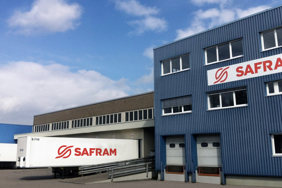
Safram makes a new start at Erkrath-Düsseldorf
July 4, 2012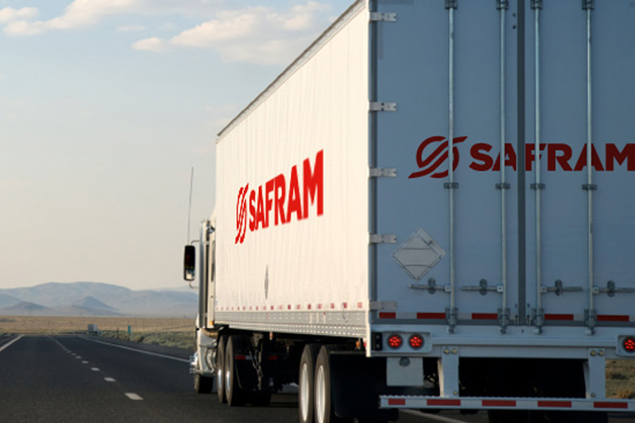
With new premises in Geneva inaugurated in 2009 and the extension of our European network, SAFRAM is deploying its modernisation programme in text-book fashion. An ideal time, then, to develop an entirely new visual identity.
Brand renewal born of change
Our remit was simple: to update our visual identity to reflect our business model, the closed-circuit network concept, and the principle of mid-route trailer exchange; but also to enhance brand visibility while maintaining our traditional colour – red – symbolising SAFRAM’s dynamic approach.
A carefully-constructed visual identity
The response to this challenge is a logo which is simultaneously modern, eye-catching and familiar, symbolising our company’s commitment, without breaking with the past. Mission accomplished! You will gradually see our new visual identity popping up on our communications and our vehicles, accompanied by a slogan reflecting our dedication to you: On the road, for you, every day!

- Bright red: the red colour reflects energy and vitality. It represents a call to action, and symbolises passion and generosity, which are SAFRAM’s founding values.
- A redesigned icon, symbolising SAFRAM’s business model: a closed-circuit network, the principle of mid-route trailer exchange.
- A solid and legible typeface, lending the brand name an air of stability, solidity and strength.


